Visual identity of the exhibition
Karolina Pietrzyk and Mateusz Zieleniewski
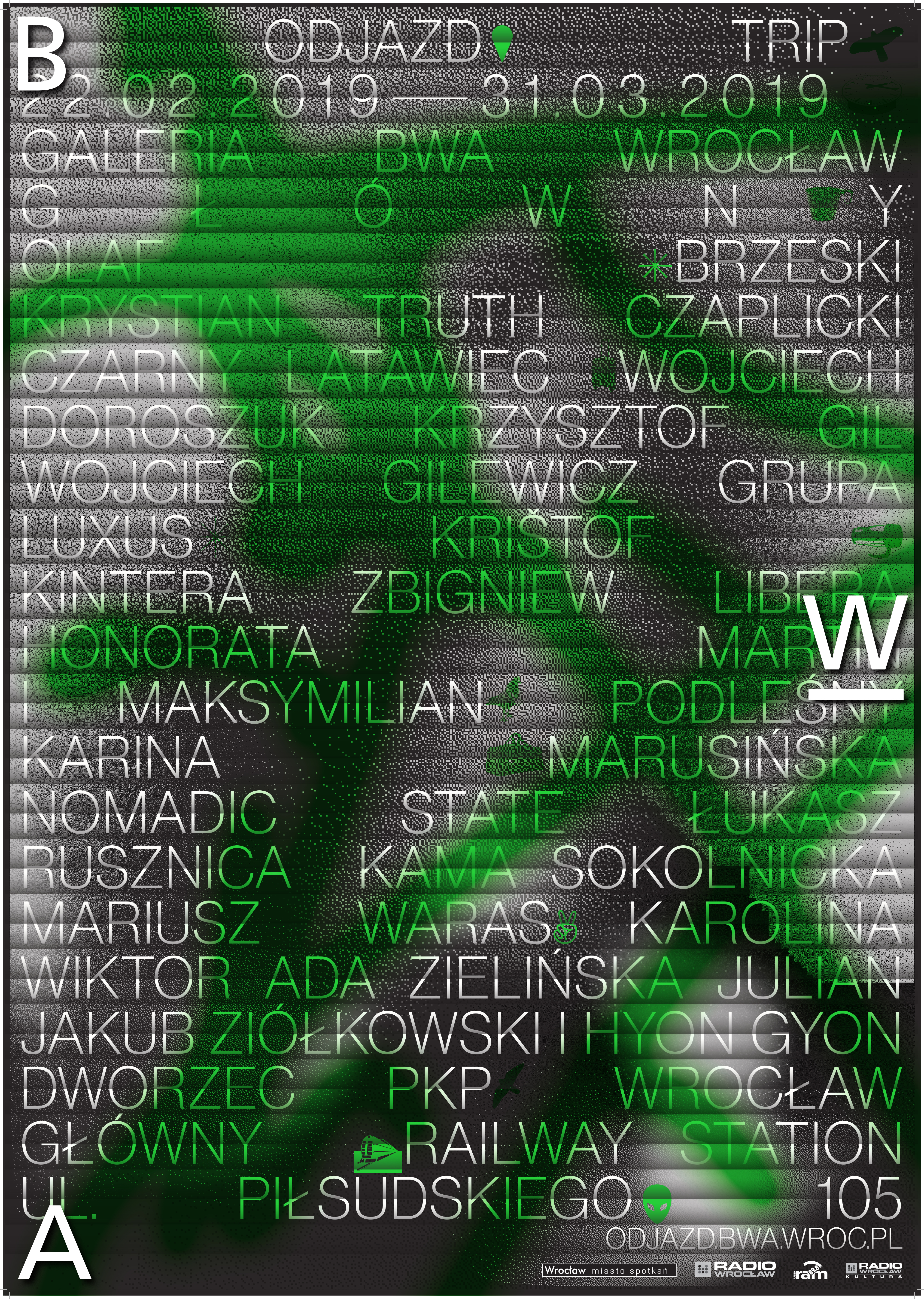
The work on the graphic design for the Trip exhibition was preceded by several walks around the railway station and an iconographic analysis of its historical and functional tissue. The selected visual key features the motif of a pragotron, i.e. a spit-flap display board, well-known from old railway stations. They were designed to inform travellers about train schedules and possible delays, but due to their mechanical charm and the sound they made, for many people across the world they have a symbolic value and represent a state of excitement associated with an upcoming change or travel.
The second factor the designers employ is green light, found at the main railway station in the form of green neon signs, elements of directional information and coloured glass. After all, green light represents movement. What is interesting, the choice of this colour was made in the last moment. In previous versions of the design, the light was orange. Now we are ready… go!